This repository was archived by the owner on Feb 28, 2022. It is now read-only.
This repository was archived by the owner on Feb 28, 2022. It is now read-only.
Component Request - SectionVisit - 1.5hrs #53
Description
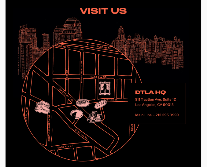
Component Description
This component is used on the contact page to display a map. Note the hover states of the icons on the map.
Design
Please also see attached screenshots for quick reference.
- Desktop: https://xd.adobe.com/view/c0d9243f-2f1f-4b20-614b-bef83eff7c19-b6e8/screen/6eda68b8-f4d2-4efd-b9d9-61c11a4ce4e5/
- Mobile: https://xd.adobe.com/view/dd5e5638-85b6-40a8-4caa-797e6dbe406a-ab6f/screen/328ee22a-2ecc-4246-8d5c-db81679b9032/
If no mobile designs provided, please use your best judgment for responsiveness.
Email drew@funkhaus.us for the design password.
Props
props: {
    title: {
        type: String,
        default: "Visit Us"
    },
    text: {
        type: String,
        default: ""
       // Mock as <h2>DTLA HQ</h2><address>...</address><p>Main Line - 213....</p>
    },
}
Developer Tips
List any developer tips here
--color-redfor the font color- The SVG hover states should just be done using CSS.
- Positing everything around the map should be done using
%so that is scales correctly.
Events
Not the hover states for all the SVGs
Required components
SVGs for illustrations can be found here: https://www.dropbox.com/sh/j5ddp8f4w8l3ii3/AAAZ1BC1JIgUBC2IKikh9xD2a?dl=0
Time & Budget
Time estimate: 1.5hrs
Budget: $150
Screenshots